Karal Max
August 19, 2015
How To Deal With Hover on Touch Screen Devices
- Drupal Planet
- Jquery
- Responsive Design
Hover Touch Screen
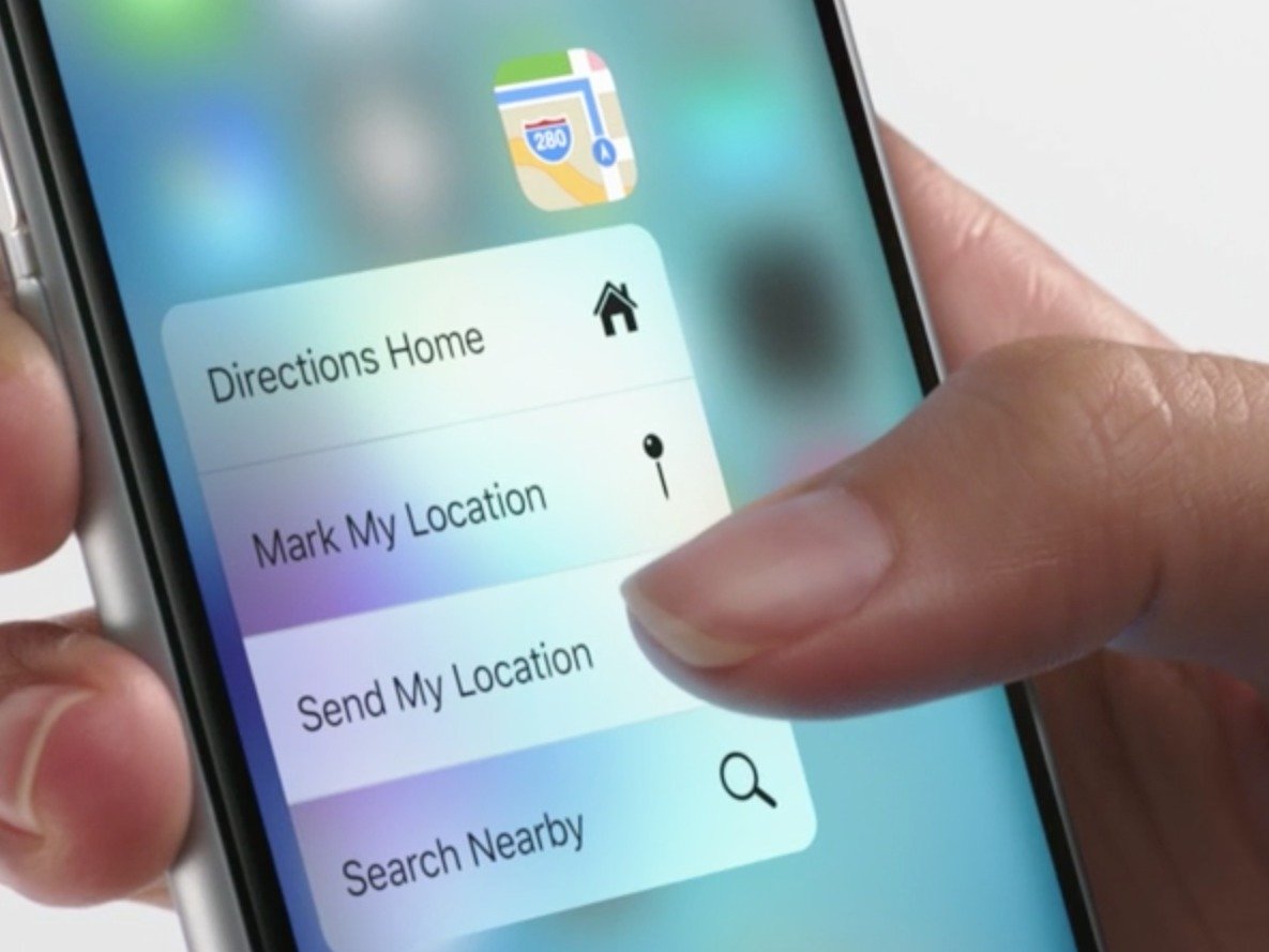
Links with hover styles on touch devices are a bit of a complication. In short, they don’t really exist on these devices. Creating fancy: hover styles can really add to the browser experience and help simplify your layout, but they simply will not work on a touch device. When a tablet or smartphone user taps your hover-styled link elements, the hover style shortly appears, and immediately the underlying link is followed/activated.
So how do we handle this problem? Do we sniff out touch devices and disable hover classes? Not at all: it can be fixed using jQuery, and with some minimal adjustments you can keep using your hover styles across all browsing devices
THE GOAL
When a touch user taps menu A, only the hover style for menu A is activated but the link does not open. After this, there are two possible options:
1. User taps menu A again -> menu A is opened.
2. The user taps menu B -> mouseover for menu B is activated and the hover style for menu A is deactivated.
Another thing to keep in mind is that if a user taps menu A, then taps menu B, and then taps menu A again, it should not consider menu A as being tapped for the second time (which would lead the browser to open the link).
WHAT WE NEED TO ACCOMPLISH
To realize our goal, we need to accomplish the following using (jQuery)
1. A user taps the ‘tappable hover’ link
2. Does the link have a hover class?
3. If it does, allow the click to proceed (return true)
4. If it does not, add the hover class, remove it from all other tappable hover links, and prevent the click from continuing (preventDefault)
That’s it.
THE (EXAMPLE)
Specify a class for the link elements you want to enable hover for, as we will use this class in the jQuery selector (in this case taphover).
<ul id="menu">
<li class="no-child"><a href="#">Home</a></li>
<li class="has-child">
<span class="megamenu-parent-title"><a href="/about-us" title="">About Us</a></span>
<ul class="child1">
<li class="no-child"><a href="/about-us" title="">page</a></li>
<li class="no-child"><a href="/about-us" title="">page1</a></li>
</ul>
</li>
<li class="no-child"><a href="blog">Blog</a></li>
</ul>
THE CSS
Make sure you specify both pseudo (: hover) and class (.hover) for the link, so that they appear the same on both a touch device and a regular browser:
li.no-child:hover, li.no-child.hover {
  display:block;
}
JQUERY
To target just touch devices, I use the touchstart event on the links to bind to.*
$('ul li.has-children').on("touchstart", function (e) {
'use strict'; //satisfy code inspectors
var link = $(this); //preselect the link
if (link.hasClass('hover')) {
    return true;
 }
else {
   link.addClass('hover');
   $('ul > li').not(this).removeClass('hover');
   e.preventDefault();
   return false; //extra, and to make sure the function has consistent return points
  }
}); Share
Get awesome tech content in your inbox
Similar Blogs
Similar Blogs
Get awesome tech content
in your inbox
Just like how your fellow techies do.
Ready to get started?
We'd love to talk about how we can work together
AWS CLOUDCOST
Take control of your AWS cloud costs that enables you to grow!
